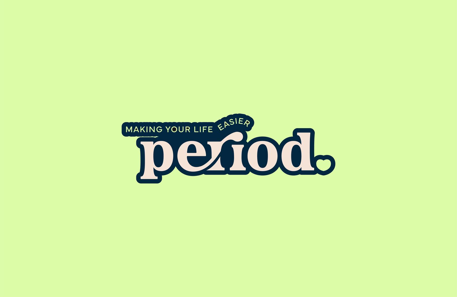
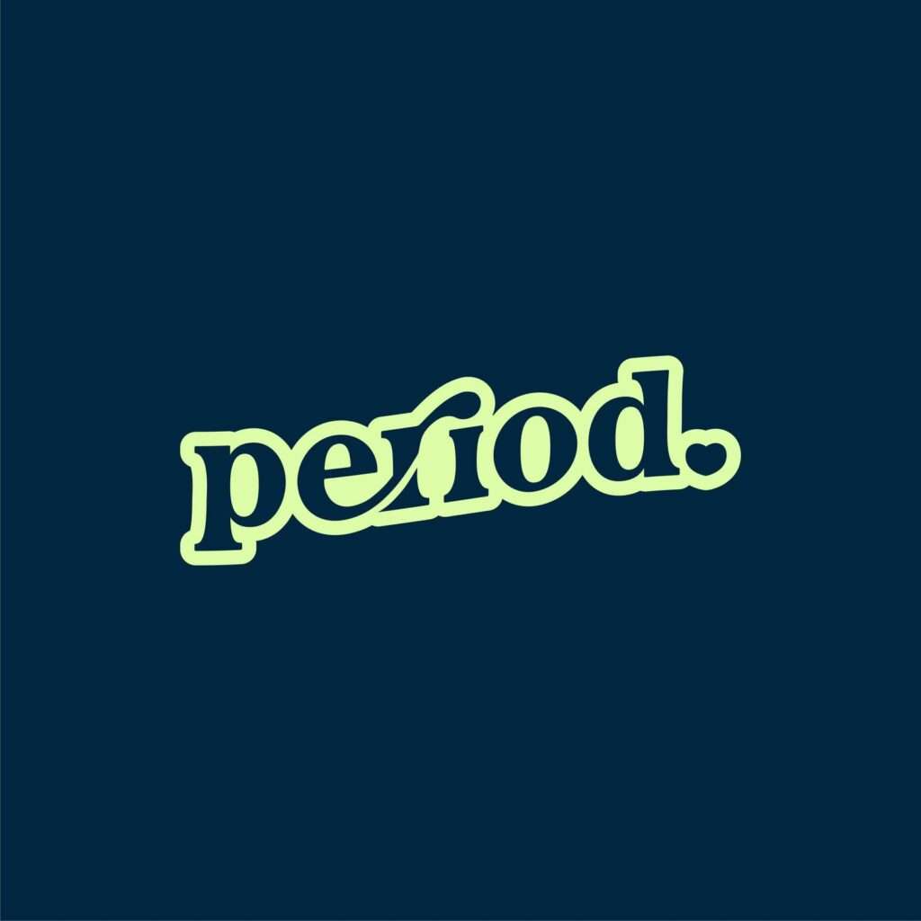
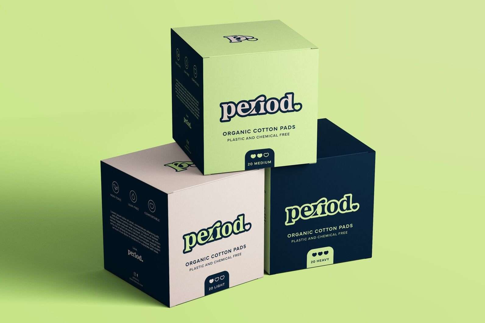
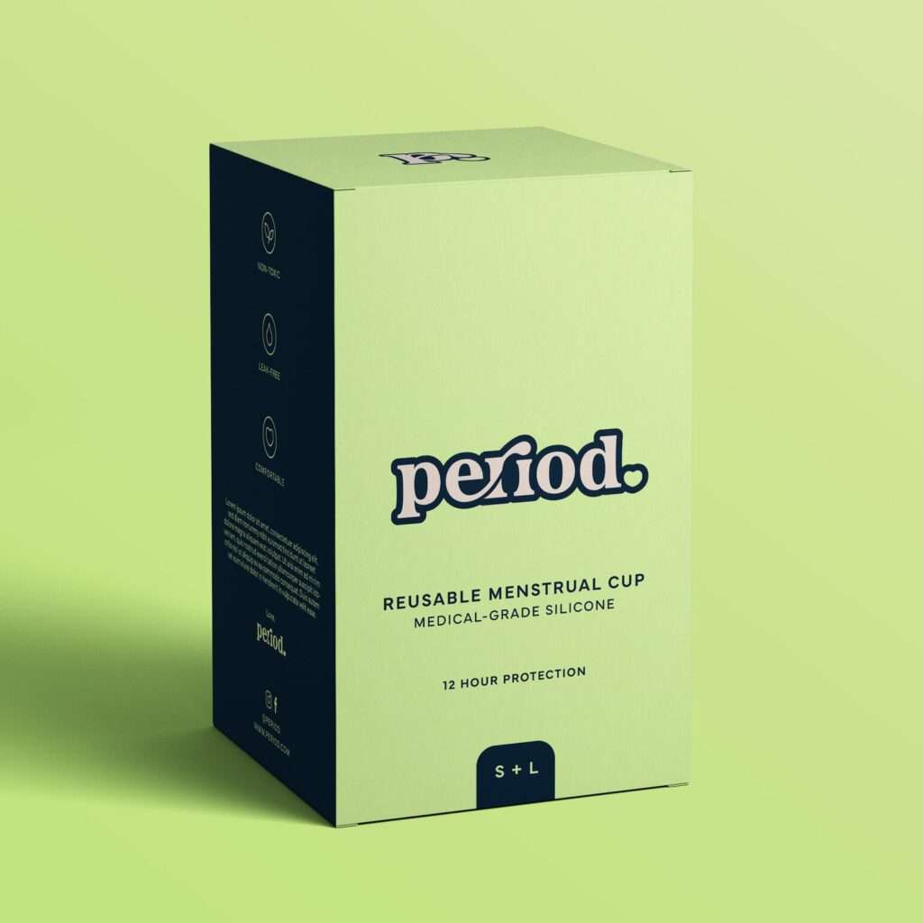
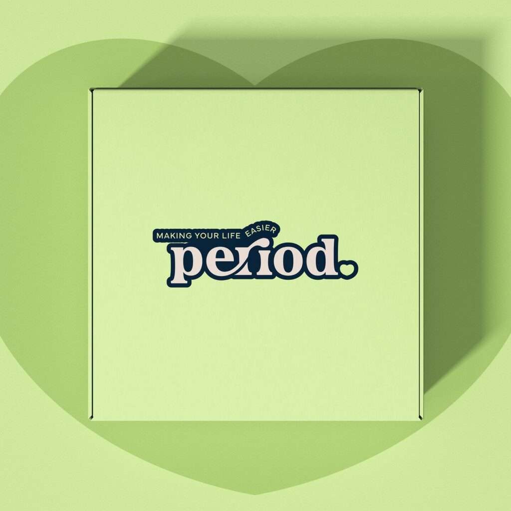
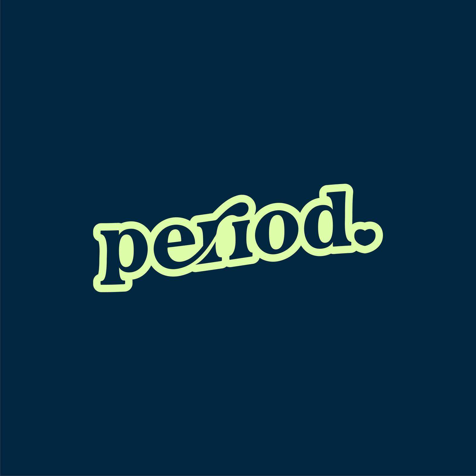
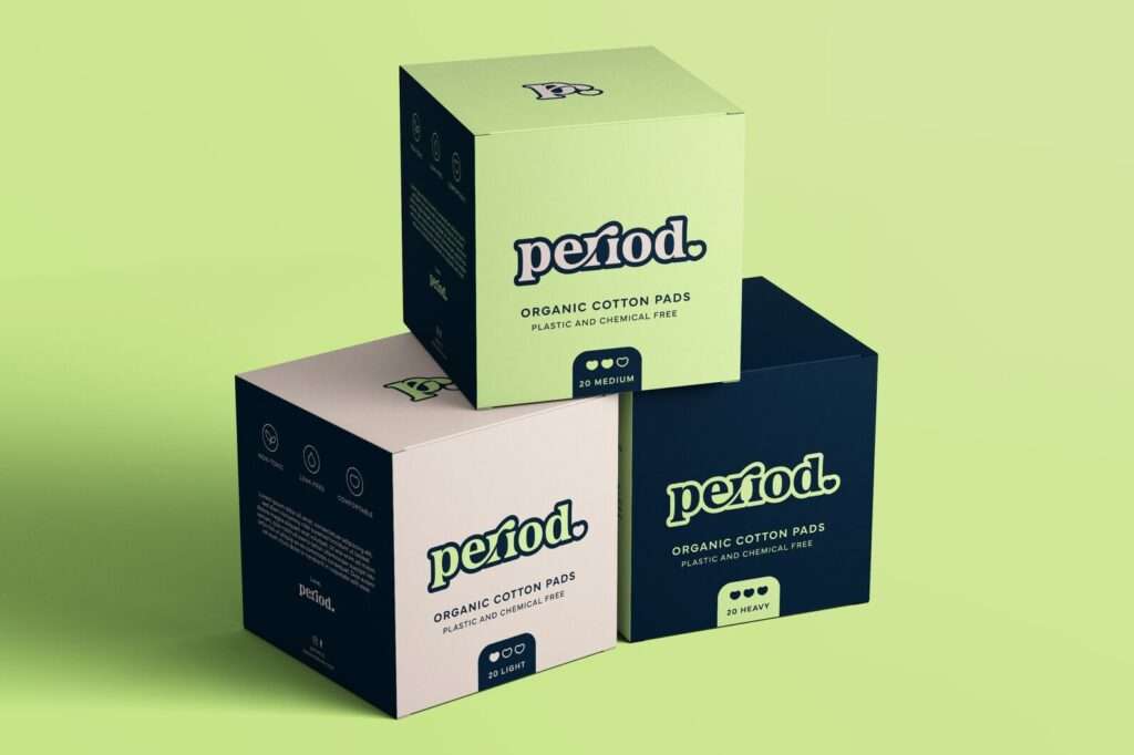
Period is an eco-friendly company devoted to making lives easier for those who menstruate. Each month, customers get a box sent to their door, packed with protection of their choice. All their products are free from chemicals and are non-toxic. For this concept, I wanted to go for a fun and bold approach to the brand. The ‘r’ represents the flow of the menstrual cycle and the ‘i’ is designed to look like a pad. I replaced the period with a heart at the end of the logo to represent care and comfort. A bright neon green was chosen to stand out from the usual pinks used in other menstrual products.
Period is an eco-friendly company devoted to making lives easier for those who menstruate. Each month, customers get a box sent to their door, packed with protection of their choice. All their products are free from chemicals and are non-toxic. For this concept, I wanted to go for a fun and bold approach to the brand. The ‘r’ represents the flow of the menstrual cycle and the ‘i’ is designed to look like a pad. I replaced the period with a heart at the end of the logo to represent care and comfort. A bright neon green was chosen to stand out from the usual pinks used in other menstrual products.